
Case study
Apex Industrial
A group of brokers launching a new industrial real estate brokerage — given a clean, lighter brand built to stand out from day one.

Challenge
Apex Industrial — a group of brokers building a new business to manage industrial leasing and client relationships — wanted a clean, lighter look to distinguish them from other industrial brokerages, on a tight timeline as they launched.
Approach
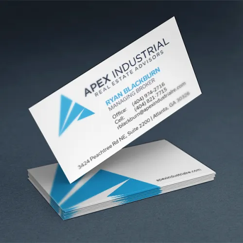
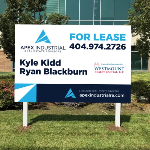
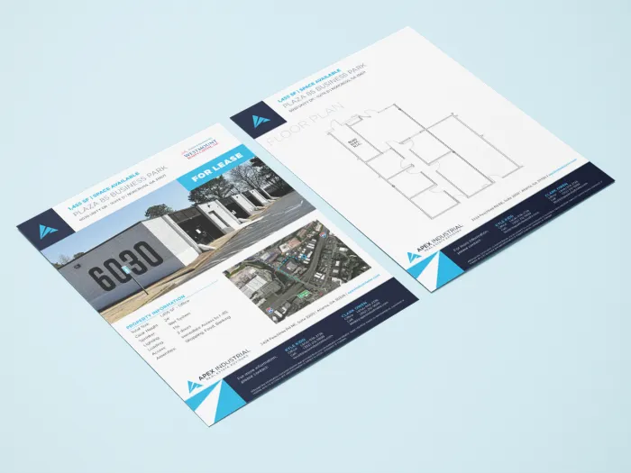
We expanded their color palette, solidified font choices, and selected an imagery style, then built collateral around voluminous white space and an eye-leading hierarchy — readable at a glance, with content chunked into small components rather than dense blocks.
Result
Apex Industrial launched with a full, robust brand identity and collateral distinct from other industrial brokerage firms — and had materials posted at new client properties before the ink was dry.
“Working with Tingen Creative to brand a new company has been a wonderful experience! They helped us from start to finish to create a brand identity we truly love and are proud to share. We will continue to use Tingen Creative as we grow and expand our new company and could not recommend Tingen Creative more.”
Have a brand that needs the same kind of clarity?
Book a Call