
Work
Real brands, real commercial real estate.
A sample of the work — what each client walked in with, what changed, and where they ended up.

Apex Industrial
- Challenge
- A logo and colors, but no codified brand as the company grew.
- Approach
- Aligned scattered materials into one real brand system.
- Result
- Grew from two people into a full industrial advisory.

Capital Development Partners
- Challenge
- Brand elements in place, but nothing consolidated.
- Approach
- Consolidated it into one style guide and pitch deck.
- Result
- A consistent brand across every future collaboration.
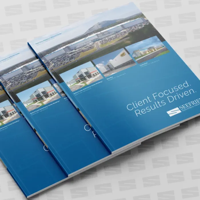
Seefried Industrial Properties
- Challenge
- Leasing collateral that moves as fast as the deals.
- Approach
- An ongoing monthly retainer, request after request.
- Result
- More than a decade and counting.
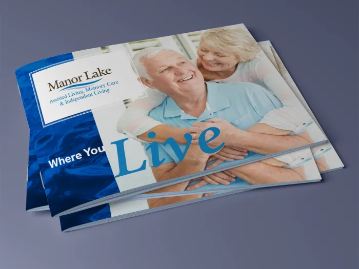
Manor Lake
- Challenge
- Marketing collateral that needed to feel consistent, piece to piece.
- Approach
- Infused the brand across every tactic they needed.
- Result
- Now the standard their in-house team runs every facility's marketing from.
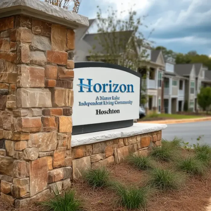
Horizon Living
- Challenge
- An identity that didn't match its audience or the Manor Lake brand.
- Approach
- Realigned the identity, then built out signage, brochures, and rack cards.
- Result
- One of Tingen Creative's largest engagements to date.
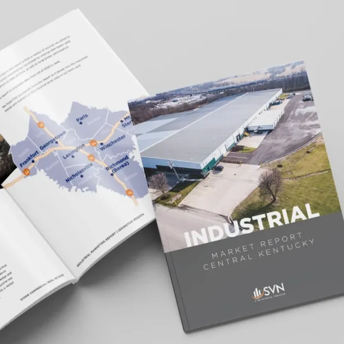
SVN | Stone Commercial Real Estate
- Challenge
- Needed a market report that could travel anywhere.
- Approach
- Designed a report built for print, digital, and social.
- Result
- Well received across the region, by SVN and its clients.
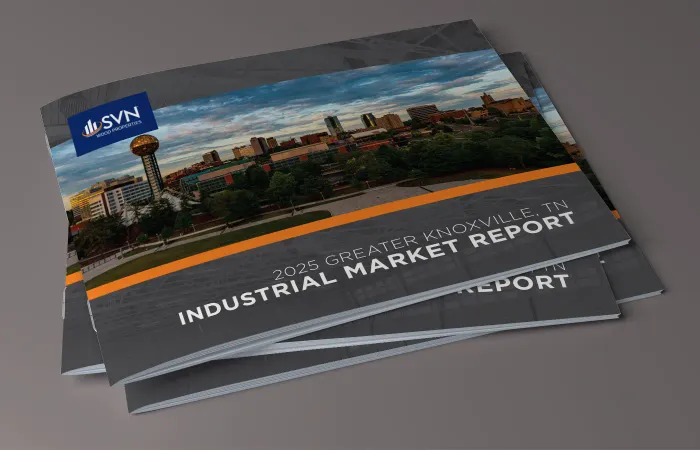
SVN | Wood Properties
- Challenge
- Needed a report that generated real excitement.
- Approach
- A market report built for both digital and print.
- Result
- Reused by the team quarter after quarter.
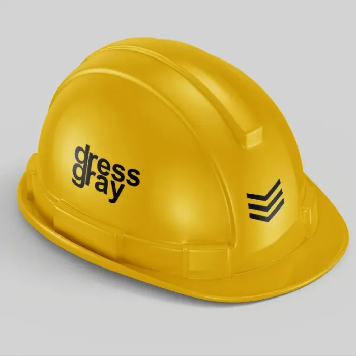
dress gray
- Challenge
- Wanted strategic thinking, not just a new logo.
- Approach
- Discovery and a brand workshop, written into a roadmap.
- Result
- A documented strategy to build the brand from.